
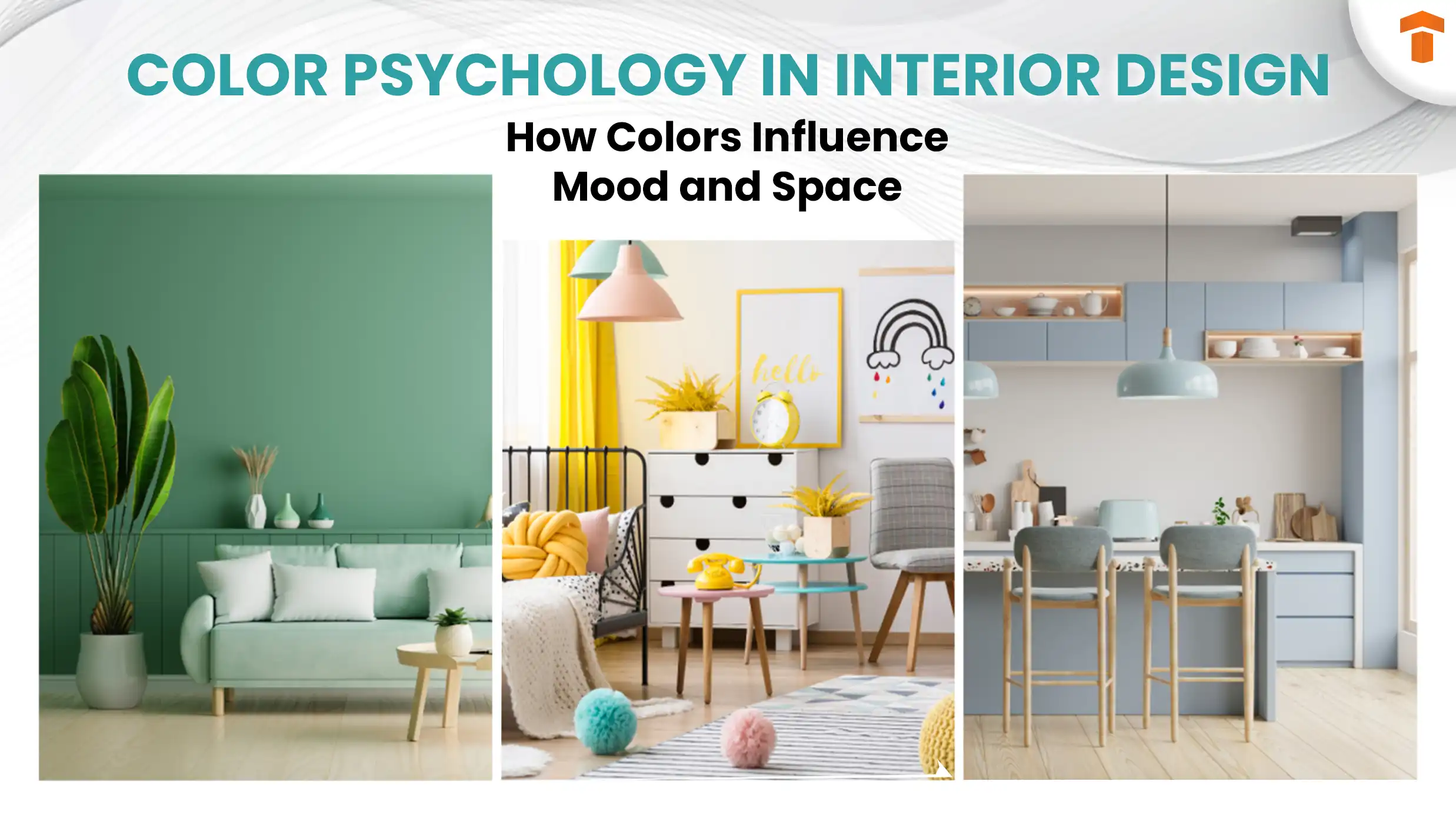
Have you ever walked into a room and immediately felt calm, energized, or even inspired? That powerful feeling often comes down to one simple element: color.
Color psychology in interior design is all about using colors to shape your mood and create the perfect atmosphere in your home. Whether you want your living room to feel cozy and inviting or your workspace to boost creativity, understanding how colors affect your emotions can help you make smarter design choices.
Ready to discover how the right hues can transform your space—and your life? Let’s dive into the fascinating world of color psychology and unlock the secrets to designing a home that truly speaks to you.
Credit: www.singhhomes.com
Color And Mood
Color influences how we feel in a room. It shapes moods and sets the tone. Choosing the right colors can change a space’s energy and calmness. Understanding color and mood helps create interiors that feel just right. Different colors bring different feelings and reactions. Let’s explore how warm, cool, and neutral colors affect mood in interior design.
Warm Colors And Energy
Warm colors like red, orange, and yellow bring energy to a room. They feel lively and exciting. These colors can make spaces feel cozy and welcoming. Red can boost passion and motivation. Orange adds warmth and creativity. Yellow creates happiness and optimism. Use warm colors in living rooms or kitchens to encourage activity and socializing.
Cool Colors And Calm
Cool colors such as blue, green, and purple promote calm and relaxation. They remind us of nature and water. Blue helps lower stress and slows the heart rate. Green brings balance and refreshes the mind. Purple adds a touch of luxury and peace. These colors work well in bedrooms and bathrooms for rest and calmness.
Neutral Shades And Balance
Neutral shades like beige, gray, and white offer balance and simplicity. They create a clean, peaceful backdrop for other colors. Neutrals make spaces feel open and airy. These shades help reduce visual clutter and calm the mind. Use neutral tones in any room to maintain harmony and allow other colors to stand out.
Credit: www.luxdeco.com
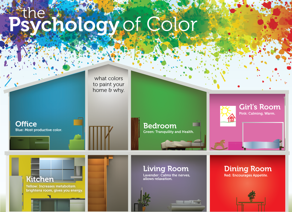
Colors For Different Rooms
Choosing the right colors for each room shapes the home’s mood and feel. Colors influence emotions and energy levels in different spaces. Each room has a purpose, and its colors should match that purpose. Understanding color psychology helps create harmony and balance throughout your home.
Living Room Hues
The living room invites people to relax and connect. Soft neutrals like beige and gray create calmness. Warm colors such as soft yellows and light oranges boost conversation and comfort. Blues in lighter shades promote peace and openness. Avoid overly bright colors that may cause restlessness.
Bedroom Tones
Bedrooms need colors that help rest and restore energy. Cool shades of blue and green calm the mind and body. Muted purples add a touch of luxury and peace. Soft pastels work well to create a soothing atmosphere. Avoid intense reds or yellows that can disturb sleep.
Kitchen And Dining Colors
Kitchens and dining areas benefit from colors that stimulate appetite and energy. Warm reds and oranges encourage hunger and lively conversation. Bright yellows create a cheerful and inviting space. Earth tones like terracotta offer warmth and comfort. Keep colors balanced to avoid over-stimulation.
Bathroom Palettes
Bathrooms need colors that refresh and relax. Cool blues and greens mimic water and nature, creating a spa-like feel. Soft whites and light grays make spaces feel clean and spacious. Light lavender adds a gentle calmness. Avoid dark, heavy colors that shrink the space.
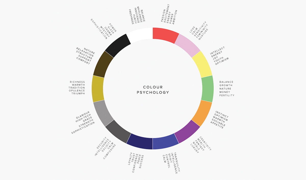
Emotional Effects Of Popular Colors
Colors influence how we feel in a room. They shape moods and energy levels. Choosing the right color can make a space feel calm, lively, or inspiring. Understanding the emotional effects of popular colors helps create balanced interiors. Each color brings unique feelings and vibes to a room.
Red And Passion
Red is bold and intense. It sparks excitement and passion. This color raises energy and confidence. Red works well in lively spaces like dining rooms. It can also increase appetite and conversation. Use red carefully to avoid feeling overwhelmed.
Blue And Relaxation
Blue has a calming effect. It lowers stress and creates peace. This color reminds us of the sky and ocean. Blue is perfect for bedrooms and bathrooms. It helps with focus and restful sleep. Light blues feel soft, while dark blues bring depth.
Green And Renewal
Green symbolizes nature and growth. It offers balance and renewal to the mind. This color promotes calm and freshness. Green suits living rooms and offices well. It reduces anxiety and encourages harmony. Soft greens feel soothing, while bright greens energize.
Yellow And Happiness
Yellow brings warmth and joy. It brightens moods and sparks creativity. This color is lively and inviting. Yellow fits kitchens and playrooms perfectly. It can boost optimism and focus. Use pale yellows for subtle cheer, and bright yellows for energy.
Purple And Creativity
Purple blends calm and energy. It inspires creativity and imagination. This color feels luxurious and thoughtful. Purple works well in studios and bedrooms. It promotes mindfulness and deep thinking. Light purples feel gentle, while dark purples add drama.
Psychological Impact On Productivity
Colors play a big role in how people feel and work inside a room. The right colors can help increase focus, creativity, and calmness. This can lead to better productivity. Choosing colors for a workspace or home office is not just about style. It is about creating an environment that supports work and mental well-being.
Colors That Boost Focus
Blue is a popular color to improve focus. It creates a calm and clear mind. Light shades of blue help reduce distractions and improve concentration. Green is another good option. It is easy on the eyes and helps maintain attention longer. Avoid very bright or flashy colors, as they can cause restlessness and reduce focus.
Colors That Inspire Creativity
Yellow is known to stimulate creativity and energy. It brings a sense of happiness and optimism. Orange is also a creative color. It encourages enthusiasm and social interaction. Use these colors in areas where brainstorming or idea sharing happens. Bright colors can trigger new thoughts and fresh ideas.
Colors That Reduce Stress
Soft greens and blues help lower stress and create a peaceful space. These colors are soothing and make people feel relaxed. Light purple or lavender can also calm the mind. Spaces with these colors feel safe and comfortable. This helps people stay calm and focused during work.
Applying Color Psychology
Applying color psychology in interior design helps shape how spaces feel and function. Colors influence moods, energy, and even behavior. Thoughtful use of color can create comfort, focus, or excitement in a room.
Designers use color psychology to choose palettes that support the room’s purpose. Mixing colors wisely enhances harmony and visual interest. Accent colors add personality and highlight key areas. Lighting also changes how colors appear and feel.
Choosing A Color Scheme
Select colors based on the room’s mood and function. Soft blues and greens calm spaces like bedrooms or offices. Warm reds and oranges energize kitchens or living rooms. Limit the main colors to two or three for balance.
Consider the room’s size and natural light when picking hues. Dark colors make spaces feel cozy but smaller. Light colors open up rooms and create brightness. Use color psychology to match feelings with the room’s use.
Combining Colors Effectively
Pair colors that complement each other to avoid clashes. Use the color wheel to find harmonious combinations like complementary or analogous schemes. Balance bold and neutral colors to keep the design pleasant.
Mix warm and cool tones carefully to create contrast and depth. Avoid too many bright colors together; they can overwhelm the eye. Simple combinations often work best for a calm and inviting look.
Using Accent Colors
Accent colors highlight features and add visual interest. Use bright or bold hues on pillows, rugs, or artwork. Accent walls painted in a strong color can create focal points.
Keep accents limited to one or two colors to avoid chaos. Choose colors that contrast with the main palette but still fit the mood. Accent colors help express personality and style without overpowering.
Lighting And Color Interaction
Lighting changes how colors look and feel in a room. Natural light shows true colors, while artificial light can shift hues. Warm lights make colors appear softer and cozy.
Cool lights bring out blues and greens but may make warm colors dull. Test paint samples in different lighting before deciding. Adjust lighting to enhance the color’s mood and effect.
Credit: www.technostructacademy.com
Cultural Influences On Color Perception
Colors carry deep meanings shaped by culture. Interior design uses these meanings to influence mood and space feel. Different cultures see colors in unique ways. Understanding this helps create designs that connect with people.
Western Color Meanings
In Western culture, colors have specific emotional ties. Red often means passion or danger. Blue brings calm and trust. White stands for purity and peace. Designers use these ideas to set a room’s tone.
Eastern Color Symbolism
Eastern cultures assign different meanings to colors. Red is lucky and joyful, used in celebrations. White can mean mourning and loss. Gold represents wealth and power. These colors guide choices in homes and temples.
Personal And Cultural Variations
Color meanings vary even within cultures. Personal experiences change how people see colors. A color might feel happy to one, sad to another. Designers must balance culture with individual taste for best results.
Common Mistakes To Avoid
Choosing the right colors in interior design can change a room’s mood and feel. Many people make mistakes that reduce these benefits. Avoiding common errors helps create a balanced and pleasant space. Understanding these mistakes makes color choices easier and more effective.
Overusing Bold Colors
Bold colors grab attention but can overwhelm a room. Using too much bright red or deep blue can make a space feel small or chaotic. It is best to balance bold colors with neutral tones. This creates harmony and keeps the room comfortable to live in.
Ignoring Room Function
Each room has a purpose that affects color choice. Bright colors suit active spaces like kitchens or playrooms. Soft, calming colors work well in bedrooms or study areas. Ignoring the room’s function can lead to discomfort and stress.
Neglecting Natural Light
Natural light changes how colors look in a room. Dark rooms need lighter colors to feel open and bright. Rooms with lots of sunlight can handle richer, deeper shades. Not considering light can cause colors to look dull or harsh.
Trends In Color Psychology
Color psychology plays a vital role in shaping interior design trends. It helps create moods and atmospheres that suit different lifestyles. Designers now focus on how colors impact emotions and well-being. This shift leads to exciting new color trends in homes and offices.
Biophilic Design And Greens
Biophilic design connects people with nature through colors and materials. Shades of green dominate this trend. Green symbolizes growth, calmness, and balance. It brings a refreshing vibe to any space. Using green plants and natural elements enhances this effect. It promotes relaxation and reduces stress indoors.
Minimalism And Neutrals
Minimalism thrives on simplicity and clean lines. Neutral colors like beige, white, and gray are key. These tones create a calm and uncluttered environment. They make rooms feel spacious and bright. Neutrals also offer a perfect backdrop for art and furniture. This trend supports focus and clarity in living spaces.
Maximalism And Vibrant Palettes
Maximalism celebrates bold colors and patterns. Vibrant palettes include reds, blues, and yellows. These colors add energy and personality to rooms. Mixing different hues creates a lively and dynamic look. This trend encourages creativity and self-expression. It turns interiors into joyful and inspiring places.
Conclusion
Choosing the right colors shapes how you feel in any room. Warm colors bring energy and passion, while cool tones calm and relax. Each hue can influence mood and productivity. Use color thoughtfully to create spaces that match your needs.
Simple changes in color can make your home feel more welcoming and balanced. Remember, color affects more than just looks—it impacts your daily life too. Experiment with shades to find what suits you best. Your space should support comfort and happiness every day.
No responses yet